Here is some of the feedback i got from my audience..
Person A: Well done, its good.
Person B: I really enjoyed watching your video, the only thing wrong was the syncing at the beginning of the music video and i didnt understand the girls miming but this was unusual.
Person C: I love how the character fits perfectly with the voice.
Person D: Everything flows and its been edited really well. Impressive.
Person E: ITS SO GOOD! THE SONG IS NOW STUCK IN MY HEAD!!
Wednesday 28 March 2012
Anamatic
Preparing for Audience Feedback
There are many ways in which i allowed my target audience to view and leave feedback for our product. Not only did we do a showcase with our peers to improve our product, but i also used social networking to get people to give me feedback.


A Reflective Summary Of The Problems Faced In The Group
- Dis-organisation in the group - we were hardly ever free at the same times and the actors were hard to get hold off as this meant we had to have 6 people to be free at the same time. This causes us to have a lot of cancellations with filming and it took a very long time to get the filming done. We filmed 2 days as a group, one day where it was just two member and the battery died on the camera and then another day where we finished the filming. There was times were we went out of our lesson to film little parts but this was all individual as it was faster.
- The group split towards the end as the editing was done by Mahida and myself and i felt that there was a lot to be done with just the two of us.
- Lack of media equipment meant that we couldn't always book a camera when we wanted to.
- Christmas and Half Term breaks meant there was bit gaps where we weren't filming as we took holidays and had other commitments.
- There was also work from other subjects and it was hard to handle all of it at once.
Tuesday 27 March 2012
Friday 23 March 2012
FINISHED!
So we planned out filming as i mentioned before. Mahida and i filmed myself and 2 other girls. One of the girls was a bit too shy and it wasn't successful. Zaq and Joe filmed another girl. However, i chose to use a setting in front of a bricked wall which i think represents entrapment ot feeling sad and suppressed. I did mention this to the boys for where they were meant to film but they didn't follow the right instructions and filmed in a different location which changed what we were trying to portray. When it came to the last bit of editing, the boys uploaded the footage, so i came to edit today and couldn't find the footage. After searching the mac i somehow found it, but they had only uploaded myself, the footage they shot, and the girl who was too shy, the other girls footage was missing. So we just left it and edited with what we had. In the end it worked but we had a lot of difficulties and problems. But it is all done now.
Tuesday 20 March 2012
Test Footage
This is the test footage we used to practice filming. We ended up using some of this for our video.
Front Cover

This is the front cover to my digipack. It has kept with the screen and has an iconic image of him looking depressed which i like. Its simple and effective. I like the name around the edges and also the R is backwards b i like that too.
Monday 19 March 2012
Last Min Touch Ups
With our editing fully done up to 3 minutes it looks fine, but the end footage is too long and needs to broken up and we also have a few gaps right at the end. The aim for tomorrow is to bring in the idea of voyeurism into our music video. I have seen in a few music videos where there is a male voice singing but the image you see is a woman. This is not just something in the Indie genre but also in others. This brings in Goodwins theory of the notion of looking. I think have clips of girls singing in between the long footage will not only break up long shots but also make our video a bit more interesting. After telling Mahida my idea we decided to go ahead with it as it was taking too long to wait for us all to be free to film or letting Zaq and Joe do it. So tomorrow Mahida and I have arranged for myself, and 3 other girls to be filmed during a free and will edit this in later on during the day. If we can find any more people then this will be great but at short notice I don't know who we can use.
Here are the videos I have seen with the same sort of ideas..


Audience Research - Questionnaire
This questionnaire was sent to a random range of 10 people.
Please complete the following short questionnaire for my A Level media studies coursework regarding music videos. The information will be used to establish a target audience and their likes and dislikes.
1. Gender MALE / FEMALE
2. Age 15-20/20-25/25-30
3. What is your favorite genre of music?
4. Do you prefer narrative or performance based videos? PERFORMANCE/NARRATIVE
6. Do you think music videos should have a happy ending? HAPPY/NOT HAPPY
7. How many settings do you expect to see in a video? 1 2 3 4 5 6 7
8. Other than audio, what attracts you to a music video?
Performance/Effects/Interesting shots
Saturday 17 March 2012
Inside the Album


This is another page inside the album cover. I also kept this grey-scale to stick with the whole theme of the album. I slightly blurred the image inwards do that the artist is blurred more than the rest of the image which i think is quite effective and you have to really concentrate to notice it. This subtle effect keeps everything simple as it is quite a nice picture and i don't really want to ruin that.

I really like this picture. It actually has nothing to do with our shoots, its a personal picture i have taken myself. I chose plimsoll trainers as this is very indie, the female and male shoes shadow the start of our music video. Again, it is grey-scale. The sun shining downwards has a happy feel but because it is in the corner this could mean it is in the past. The setting is also similar to the rest of the photos.

I think this is my least favorite out of all the pictures but i like the lighting in it. The fact that he is drinking in a pub sort of fits in with the theme of the music and the lyrics. Its still grey-scale and it works with the other pictures. However, the quality isn't that great as the light was shining in the wrong direction. Although this looks good in the picture, it impaired the quality of it.
Back Cover

Friday 16 March 2012
Poster Analysis
For my Digipack i have decided to produce an album cover with 2 pictures for inside the album and also back cover, and for my second choice i have chosen to produce a poster. Therefore i have decided to look at one of Paolo Nutini's posters to see what conventions are typically used in the music industry so i can use this information to help me produce my own.


- Name of Artist
- Location in background
- Date
- Location
- Contact details (ticket hotline)
- Website of venue
- Website for tickets
- Promotion of album
- Artist website
- Logos
- Production company
- Colour theme
Investigating how Paolo Nutini markets himself
Due to the changes in internet, the way a band markets itself has changed from the traditional way of just using posters and radio. There are many new ways to do this and the artist we chose is a great example.

1 - YouTube - Paolo Nutini has his own YouTube account like most of us do, he has his own channel Here he can promote his music freely. There is also a shout 'about me' action and you even have the opportunity to contact him. You can view all the songs he has uploaded and playlist's that he has created. The theme on his page is personalised in the same theme as his website so its easy to know its him.
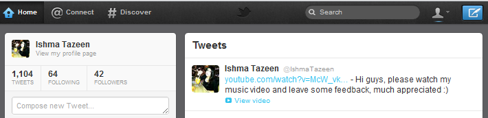
 2 - Twitter - On Twitter, he can also promote his music videos. But he can also talk to his fans and promote himself with his 'tweets'. You can view his followers, who he follows, and hes even written a bit about him, as well as posting regular pictures and regularly updating his twitter account. Like his YouTube, his Twitter is also personalised with his website theme.
 3 - www.last.fm - LastFm is a website containing most bands, its a way in which an artist can promote themselves. It has videos, bio, pictures, events, albums, tracks and much more. Its a great way to connect with your favorite stars.
 4 - MySpace - MySpace was probably one of the first places that came about when online promotion stated. Here you can see videos, get updates, contact the artist, see pictures, read about them and all sorts. There is even a player which lets you listen to the music while you view the website and even lets you download straight from the website. This also has a theme.
 5 - Website - As i posted before, a website is a big way of promoting, especially when its a way to sell merchandise. Merchandise is a great tool to promote an artist because when people buy T-shirt ect, it creates another way of marketing through others seeing people wear it. On the website you can watch videos, listen to music, see lyrics, look at pictures, see news updates, and even be part of the forum. This uses his main theme, and its a really important form or promotion to an artist.
 6 - Facebook - Paolo Nutini has over 700,000 followers on Facebook, therefore it is an important channel of promotion for him. You can see all his photos, videos, events and information. Its also a create way for him to post regular updates, and it also promotes his merchandise.
 7 - Bebo - Although Bebo isn't used as much today, its still a way for an artist to promote themselves. You can see all the information about the artist, his pictures and his followers.
As you can see there are many ways for an artist to promote, they are all very similar and easy to access. The growth of the internet has made promotion so easy and i think this has had a great impact on the music industry.

1 - YouTube - Paolo Nutini has his own YouTube account like most of us do, he has his own channel Here he can promote his music freely. There is also a shout 'about me' action and you even have the opportunity to contact him. You can view all the songs he has uploaded and playlist's that he has created. The theme on his page is personalised in the same theme as his website so its easy to know its him.


As you can see there are many ways for an artist to promote, they are all very similar and easy to access. The growth of the internet has made promotion so easy and i think this has had a great impact on the music industry.
Martin Solvieg - C'est La Vie

Kanye West - 808s & Heartbreak

Tuesday 13 March 2012


Monday 12 March 2012
Linking Lyrics to Music Video Plan
Picking up the pieces PICKING UP SOME SORT OF OBJECT
Of the wreck you went and left SOMETHING MESSY
And I'm dealing with dilemmas THERE WILL BE A 'DILEMMA'
In my now so stressful life
And I'm drinking stronger spirits IN A PUB
I made my home here on the floor
And I'm losing all ambition and goals LOOKING FED UP
I'm going all out EXITS ROOM
I'm thinking you're just as bad
No sleeping at night
But I'm going from bar to bar
Why can't we just rewind CLOCK?
Oh remember at 16
Oh the crazy drunken night we had ALCOHOL?
When i kissed you in the hallway
Then i took you straight to bed
Two years on
And I'm still that same boy i was
No sleeping at night
But I'm going from bar to bar CAMERA SWINGS LEFT TO RIGHT - BAR TO BAR
Why can't we just rewind oh
No sleeping at night
But I'm going from bar to bar
Why can't we just rewind oh
You might blame it on me
But you insisted that we fall CAMERA SWOOPS DOWN?
Wiped your hands of me
And said you needed more, more, more
I'm not sleeping at night
But I'm going from bar to bar
Why can't we just rewind oh
I'm not sleeping at night
But I'm going from bar to bar
Why can't we just rewind oh
Can't we just rewind PUT SOMETHING DOWN
Some of the lyrics are linked directly to the words, whether they are seen exactly when the words are said or maybe later on in the footage. Indie videos are more about narrative than the lyrics linking so we have tried to keep a mixture between the two.
Pictures for the Digipack
Today Mahida, Joe and myself were discussing pictures we could put on our digipack as this is the only thing left to do other than a few things to touch up on the video. A typical Indie album cover is either bright and colourful or depressing and gloomy. I think ours would be suitable to be dark and gloomy, but they are always unique and different
We would need to have a picture of him on the front cover and so we chose this picture which we shot on our first day of editing.

Inside we would have this picture as it sticks with the theme.

And then on the back cover we would have this as again it sticks with the theme but its simple and so you would still be able to read the track list etc.

How the planned music video fits in with research
Earlier on i did a post about the codes and conventions of a typical Indie music video. This post is to compare how out planning of the music video actually fits in with the codes and conventions.
- Shows artist or band throughout the video - YES
- Some special effects – often quite arty and creative so the video is more symbolic to its lyrics - YES a little
- Calm setting- YES the park scene
- Sometimes black and white/grey scale or very bright depending on the tempo - YES calm colours with black backgrounds used
- Has a narrative which is always simple - YES
- Use of close ups - YES
- Performance of the artist or band itself as it shows them to be different and talented - YES
- High usage of crane shots but there is a variety of different shots also - YES
- Dark and mystic locations garages, warehouses and streets etc. - YES a gloomy park
- Instruments are shown - YES a guitar
- The actors or artists will wear dark casual clothes – skinny jeans, t-shirts, denim with longish hair - YES
- Has longer shots than rock music so the editing is not as fast paced - YES
- A lot of use of lighting – dark lit or dim or just focusing on the band or artist - YES
Changes in Software
As most the editing has now been done, i have noticed how much i have progressed from the preliminary task where i was using iMovie. I found it very simple and easy to use with basic editing skills involved. Now i have been using FinalCut which is so much more complex. I have found it hard to get hold of but it offers so much more in term of effects and you need a lot more skill to use it.
Wednesday 7 March 2012
Rihanna - Talk That Talk

news paper text and hence goes with the
title of the album 'Talk That Talk' meaning
spreading news around.
.jpg)
Tuesday 6 March 2012
http://www.paolonutini.com

The codes and conventions of the indie pop genre are not only seen in the music video and album art but also on the website. The white/cream background shows connotations of purity and perfection with a positive feel to it. It can also suggest simplicity which signifies how his music is. The use of black writing makes it easy to read and stand out against the white. The pictures are very indie as they look like paintings and the writing itself is very free flowing.
The information given is for both entertainment and at the same time engage the audience. On the home screen you see a sales promotion, this is often seen on websites to engage and encourage the audience to buy something. The home page also has a lot of hyperlinks to lead to new pages which shows that the website uses technology efficiently and making the most of out IT skills.
One thing that website does not have is a search box which could be improved.
Friday 2 March 2012
Drake - Take Care
.jpg)
The main issue raised about this album art is the owl. There are a few arguments for the meaning of the owl the first is that the owl is the Moloch which represents the ideology of Bohemianism. According to the internet this is 'a person, as an artist or writer, who lives and acts free of regard for conventional rules'. Twice a year they have a ceremony called the cremation of care which takes place in front of a giant statue of an owl. This simply represents Drake's ideology and how he practices Bohemianism. The second argument is that owls are often considered to be a bad omen by some western cultures. Therefore we see Drake in a not so good place and therefore this symbolises that he is a bad omen. The third argument is that owls are nocturnal living creatures and have a stigma attached to it just like the underground rap music where Drake first started off so this shows him representing his music and what he really loves. The owl is a symbol from the Hebrew alphabet - Hebrew is the language of the Jews - Drake's mother is from a Jewish background, so this can just represent who he is and where he comes from. Some say this owl means none of these three arguments, instead, the letters OVO (October's very own) just look like an owl and have no real meaning to it.
I have to say this is probably my favorite album, by my favorite artist, with an amazing cover (which is why i have written in so much detail). It really is amazing, its just missing his name!
'He has it all, money, power, fame, but he doesn't have happiness'
Subscribe to:
Posts (Atom)